


LANDSCAPE
WINNER: JAMES DOYLE DESIGN ASSOCIATES
Polished and poised, James Doyle’s design for an Arts & Crafts carriage house matches strict geometry with abundance
Susan Tamulevich
photograph by neil landino, jr.
This year’s first-place winner, James Doyle of James Doyle Design Associates, is no stranger to readers of this magazine. The Greenwich-based design firm is a previous Innovation in Design Awards winner, and the scheme for Harmony Farm, the cover story for the May 2011 issue, also earned Doyle the title of 2010 International Landscape Designer of the Year from the Association of Professional Landscape Designers.
left: James Doyle; right: neil landino, jr.
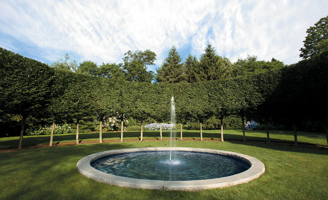
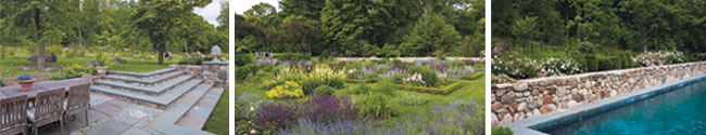
James Doyle’s winning landscape for 2011 is a classic Arts & Crafts estate with winding paths, shrub and perennial borders and water feature—all created for the 1899 Byram Carriage House in Greenwich. The gardens are a marvelous mix of the relaxed and the precise, of abundance and restraint. What is James Doyle’s secret? There are a couple of things that set his work apart. Doyle has a sound feel for classic, estate gardens, particularly for a style that recalls the work of early 20th-century designers Russell Page (a mentor) and Beatrix Farrand. The style fits seamlessly into the natural environment yet relies mightily upon precision planting and take-no-prisoners maintenance: Note those sheared masses of Japanese holly and arcade-like beech. (They assure us that this is accomplished with once-a-year pruning.)

clockwise from top: photographs by ber murphy, neil landino, jr., james doyle and neil landino, jr.
click to view more images from James Doyle Design Associates
LANDSCAPE
Innovator 2: MARTHA BAKER LANDSCAPE DESIGN, LLC
A designer reworks three parcels to create the ultimate waterfront estate
Susan Tamulevich
photographs by john m. hall
author and editor Martha Baker of Martha Baker Design, LLC, of Greenwich, is the consummate designer—a real garden stylist—someone with strong visual direction who is fully capable of bringing any errant landscape under her control. Baker has an arsenal at her fingertips—components carefully detailed in her three books on garden ornaments, furnishings and pools—that she distributes liberally in her landscapes with polished aplomb.
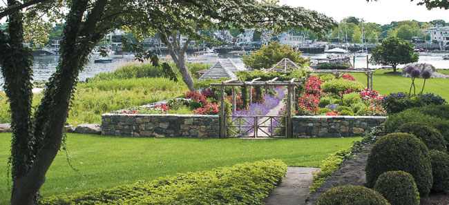
The designer’s challenge with this sweeping waterfront was to unite three two-acre parcels into a single, cohesive design. “But at the same time,” Baker notes, “I wanted each area to have its own personality: seaside meadow, walled garden, pool and rose garden.” Her crowning achievement is this virtuosic array of walls, fences, seating areas and pergolas, in styles ranging from the rustic to the rather refined. The different areas are each distinctive in style and plantings, but there is a definite logic to the progression. Formal areas surrounding the house give way to ever more relaxed spaces as one moves toward the water. Limited palettes of white flowers break into cheery, colorful mixes of blues, reds and oranges.
One major walkway cuts through a rose garden—a rustic, 300-foot, cedar pergola that leads to the dock and waterfront. The summer plantings pair robust hedges of lavender Russian sage, Perovskia atriplicifolia, with bold cerise roses. Two tool sheds stand to one side, disguised as garden follies.
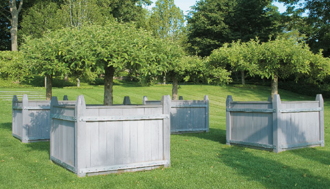
There is no shortage of pots and box planters: Four square tubs hold topiary apple trees; two cast-stone saucer-shaped planters contain a mosaic of colorful succulents. But the planters and hardscaping ultimately meander into a tousled wildflower meadow that eventually fades to beach, water and sun.
click to view more images by martha baker landscape design, llc
LANDSCAPE
Innovator 3: DEVORE ASSOCIATES, LLC
A harmonious collaboration brings a client’s Arts & Crafts vision to life on 113-acres along the Hudson
Susan Tamulevich
photographs by david heald
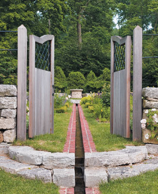
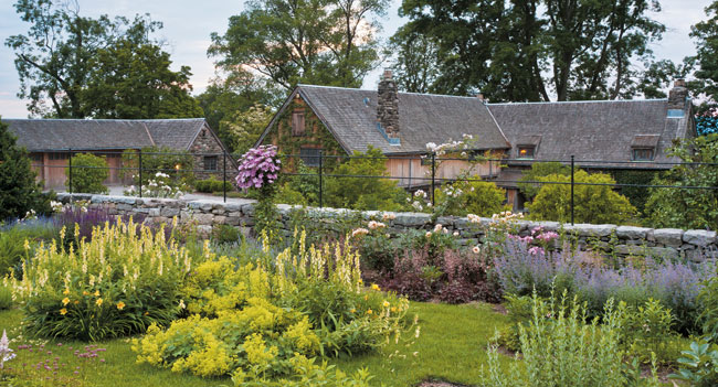
A 113-acre farm located on a steep slope in the Hudson River Valley is home to an avid gardener and topiary expert. The homeowner wanted to develop the property in an organic manner while incorporating an entry court, horse pasture, vegetable and herb gardens, an orchard, a cutting garden, pool, dining terrace and tennis court.
Devore Associates, LLC of Fairfield worked collaboratively with the client. In a real sense, Diane Devore acted as the project’s Edwin Lutyens to the client’s Gertrude Jeckyll—providing the architectural framework (walls, terraces, steps, pool) into which the client’s pastoral and horticultural activities would fit, while maintaining the desired Arts & Crafts aesthetic. There are, in fact, direct references to signature elements from Arts & Crafts gardens in the hardscaping: circular stairways, a rill (or narrow water channel) lined with antique brick, wrought-iron gates and fencing, and low box-edge parterres filled with billowing perennials. One garden is planted with all-white flowers so that it can be appreciated by moonlight. The garden of box parterres is planted in deep purples and pinks around the edges, blending to blues and yellows in the interior beds.
The siting and planting was done with restraint to complement the larger natural world. From spring through fall, the garden is filled with color.
click to view more images from Devore associates, llc
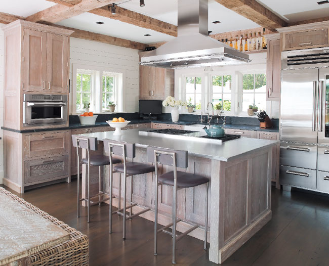
KITCHEN
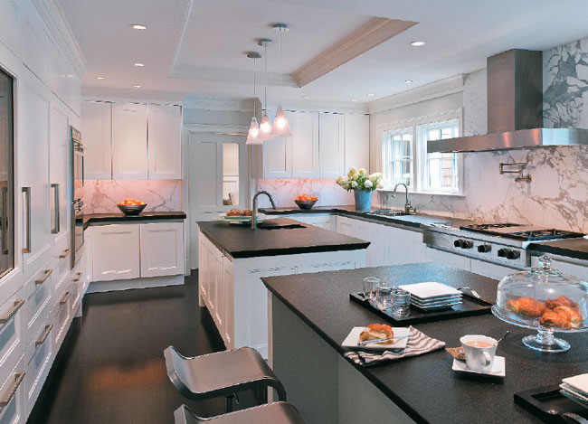
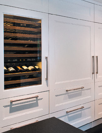
WINNER: ALISBERG PARKER ARCHITECTS
The kitchen is more than just somewhere to cook—it’s a place to congregate, to get creative, and above all, a spot where families can relax and enjoy being together.
Ann Kaiser
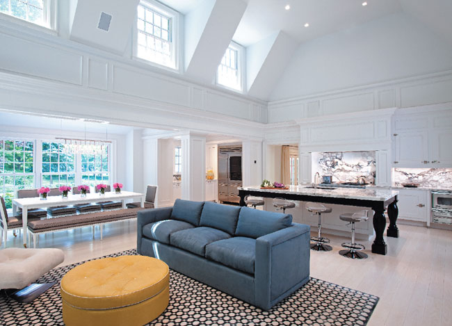
photographs by keith scott morton
The kitchen renovation of this summer home in Katonah puts the focus squarely on family. Susan Alisberg and S. Edward Parker III removed the second floor to create an open, light-filled space that connects much of the house to its main hub of cooking, casual dining and socializing. Now, the kitchen opens to the basement playroom, the craft room, offices off the second-floor mezzanine and to the living area, which interior designer Cherie Zucker filled with contemporary lighting and furniture that contrast with the home’s traditional architecture. The focal point of the kitchen is a large center island, with its Breccia Imperiale marble countertop, and barstools that facilitate socializing. Custom oversize ice-box style hardware works perfectly with the large cabinet doors. The dining room, open on one side to the kitchen and living area, also has a private passage from an independent prep station—featuring a Rohl farmhouse sink and counter space conveniently nestled next to the fridge—allowing easy access for serving and clearing.

click to view more images from alisberg parker architects
KITCHEN
Innovator 2: STEVEN MUELLER ARCHITECTS, LLC AND DEANE INC.
Unique details make this space one to show off. it’s no coincidence the homeowners love to entertain.
Ann Kaiser
photographs by tim lee
This sleek, sophisticated kitchen, a collaboration between Steven Mueller of Steven Mueller Architects, LLC and Veronica Campbell of Deane Inc., was born to entertain. Two islands afford the homeowners a ton of prep space, and the design leaves plenty of room for mixing and mingling. But it’s the details that really give this space its star power. The details of the white cabinets, echoed in the profiles of the doors and moldings, contrast with a rift-cut white oak floor with an ebony finish. Stainless-steel elements like the range hood, custom-designed by Deane Inc., are elegant, and the chic, angled-in leatherized countertops, offset beautifully by the veining of the Carrara marble backsplash, add another layer of interest. Uniform cabinet doors conceal additional storage, and Amy Vitale of ALV Lighting Solutions used pendant lighting and under-cabinet illumination from Patdo Light Studio to get the whole place glowing. The overall look is comfortable, inviting and ready for a party.
click to view more images from steven mueller architects, llc
KITCHEN
Innovator 3: SHELTER INTERIORS, LLC
Relax. unwind. enjoy a laid-back meal or a casual conversation and take in the bay view. in this space, every day is a beach day.
Ann Kaiser
photographs by michele scotto of sequined asphault studio

This Darien kitchen with a harbor view, designed by Tricia Izzo and Carolyn Kron, was created with the livable, relaxed comfort of the beach in mind. The kitchen is the heart of this casual home, and the natural palette—soft grays and browns—was chosen to echo the colors of sea and sand. The French oak cabinets are custom-finished in tones of silvery oyster and pearl white, and the island features a buffed stainless-steel countertop. Reclaimed barn beams, custom-stained reclaimed beechwood floorboards and the use of white ship-lapped boards on the walls enhance the lived-in, waterfront vibe. This small kitchen, which flows right into the dining area, features a custom chandelier from Olampia that doesn’t hinder the bay view. Since space is at a premium, every inch is utilized via hidden storage inside the front end of the island.
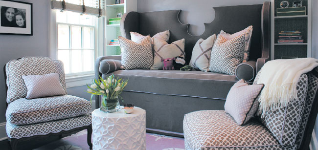
INTERIOR DESIGN
WINNER: YOUNG HUH INTERIORS
In this designer’s rambling tudor, high-end fashion and glamour meet kid-friendly furnishings and finishes
Mindy Pantiel
photographs by john m. hall

Asked to describe THE STYLE of her rambling Tudor home, interior designer Young Huh answers, “It’s Marie Antoinette meets Jean Michel Frank.” In the living room, soft gray damask-covered armchairs backed by oyster-toned walls emulate the renowned French designer’s minimalist style, but the unexpected chartreuse sofa and swoop of duchesse satin drapery in the dining room would have made the Versailles queen smile.
“I was definitely having a Marie moment when I picked that satin,” says Huh, who further indulged the fantasy with shiny curtain hardware but added a dark wood Deco-style table for restraint. “The house was built in the 1920s, and we wanted it to have a feeling of fashion and glamour.”

According to Huh, nothing adds elegance like the introduction of white, so she paired pale accents, such as a large round mirror with a Jonathan Adler lamp in the living room, and topped the sofa in the family room with furry Mongolian-lamb pillows. “White accents really help people see the contrasts,” she explains.
Balancing her desire for chic was the need for kid-friendly furnishings and finishes (Huh has three children). Enter the washable terrycloth slipcover on the sofa and the black-concrete kitchen floor. Concerned the stainless-steel and charcoal elements in the latter might feel unwelcoming to children, Huh introduced maple cabinets for balance and lively, printed wallpaper for fun.

click to view more images from Young huh interiors
INTERIOR DESIGN
Innovator 2: ANTHONY-WRIGHT INTERIORS, LLC
A renovation goes green in this Hudson River enclave, turning a tired raised ranch into a cozy cottage
Mindy Pantiel
photographs by ellen mcdermott

A series of life changes prompted interior designer Susan Anthony to purchase a 1950s raised ranch, breathe new life into the tired building, and upon completing the renovation, name her new home Acorn Cottage in honor of the surrounding oak trees. Determined to have the refurbished 2,200-square-foot ranch be as green as possible, she chose recycled materials for the insulation and roof, installed energy-efficient windows, doors and appliances, and refinished existing kitchen cabinets to better suit the home’s refreshed look. “By the time I was done, I’d reduced my energy bills by fifty percent,” says Anthony, who added an entry foyer, full bathroom, a bedroom, laundry room and four closets.
But perhaps her biggest environmental contribution was decorating her renovated home with things she already owned. After adding antique limestone floors in the entry and kitchen, and staining the original white oak floors elsewhere, Anthony fashioned a kitchen breakfast bar out of an antique shop counter: “A remnant from my former life,” she notes. Her camel-toned velvet mohair chairs are arranged around a walnut coffee table, and favorite collectibles are housed in an oversized Ralph Lauren hutch. “I filled the cabinet with family items I love like silver, china, crystal and books,” she says, “it’s utilitarian and beautiful.”
click to view more images by Anthony-wright interiors, llc
INTERIOR DESIGN
Innovator 3: PL DESIGN, LLC
Bright hues and bold patterns merge happily in this Darien home
Mindy Pantiel
photographs by georgi djotov

Fear of color was not an issue when Pavleta Landjeva designed several rooms in a classic Colonial—starting with a Mets baseball-themed bedroom for a 12-year-old boy. “The challenge was to incorporate the team’s blues and oranges and not allow the hues to overwhelm the space,” says Landjeva, who offset bold orange and white stripes on the bedroom ceiling with neutral walls.
Things calm down considerably in the children’s study where the walls are painted three shades of lavender, and a custom daybed with a quatrefoil cutout is flanked by bookcases backed with a soft green wallpaper. “It’s not a large space, so we had to keep things quiet,” she says.
In the master suite, gray-blue drapes with a hint of green establish the soothing color scheme. Predominantly sage-green embroidered bedding, and a chaise sporting a beige-and-blue-green print follow suit.
Bold hues return in the owner’s study where a painting of a garden scene inspired the cheerful pinks and greens repeated on pillows piled high on the banquette, and the quatrefoil motif reappears on a pair of bright-pink chairs. “They’re feminine and floral, and the perfect way to pull everything together,” says Landjeva.

click to view more images from pl design, llc
BATH
WINNER: BARTELS-PAGLIARO ARCHITECTS, LLC
A guest bathroom influenced by the ocean takes center stage in this Fairfield home
Cate Branca

photographs by olson photographic, llc
The owners of this newly constructed home on Long Island Sound, partners in an international maritime shipping company, loved the concept of their house as a “beached ship.” Inspired by the well-known Art-Deco poster of the ocean liner Normandy’s looming bow approaching at great speed, Bartels-Pagliaro Architects, LLC imagined a guest bathroom that would resemble a boat in an upstairs hallway. Thus began the innovative construction of a seaworthy guest bath. The home’s generous ceiling height allowed for placement of the prow on a tall wave of blue semi-transparent glass. In this unique, awe-inspiring bathroom, the glass enclosure (originally planned as clear, but changed for the courtesy of houseguests) was designed as the shower. The floors were finished with teak and maple, reminiscent of the living quarters aboard a luxurious yacht. Waterworks tile on the walls looks deceptively like beadboard wainscoting. The final result: A shipshape guest bathroom of titanic proportions.
click to view more images from bartels-pagliaro architects, llc
BATH
Innovator 2: ALISBERG PARKER ARCHITECTS
A master bath in Katonah, NY, becomes a gorgeous living space loaded with panache
Cate Branca
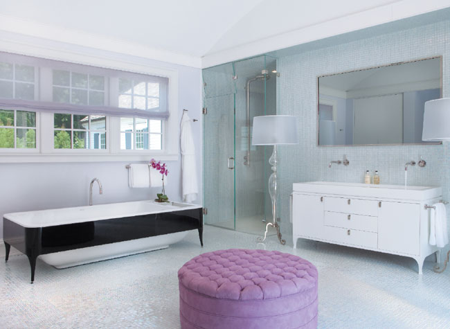
photographs by keith scott morton

Susan Alisberg and S. Edward Parker iii designed this Katonah master bath with the sleek freestanding Jaime Hayon tub in mind—that and their clients’ desire for a master bath “room.” The barrel-vaulted ceiling creates a lofty and spacious main area filled with light from large windows on one side and French doors that open onto a balcony on the other. Flanking the vanity, the shower and Duravit toilet are located behind glass walls with transom-like windows that allow air ventilation. The SICIS NeoGlass cube tile covers the floors (in wet areas) and walls. Modeled after the tub, the vanity cabinet has a single custom stone basin of Phassos marble. Intentionally fuss-free trim and cabinets don’t detract from the objects in the room, including the My Ghost artwork by Adam Fuss. A vintage ottoman, Brissi floor lamps and a built-in bench succeed in creating the comfortable sitting-parlor environment the homeowners were after.
BATH
Innovator 3: BEINFIELD ARCHITECTURE PC
Spa-like details make this Wilton bathroom a standout
Susan Tamulevich
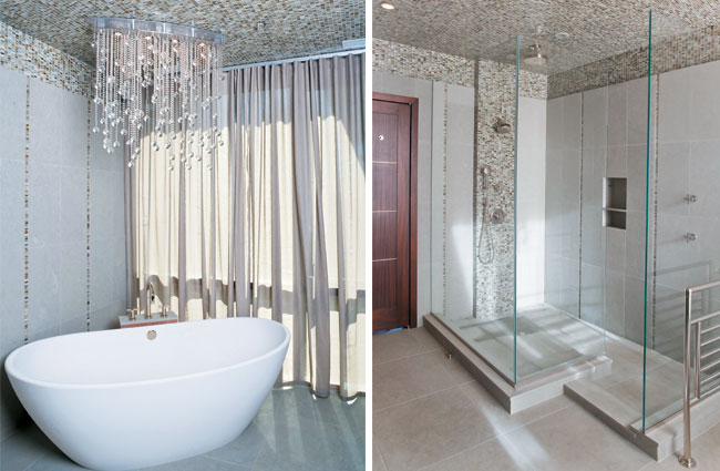
photographs by michele scotto of sequined asphault studio
In this jewel box of a bathroom by Bruce Beinfield with designer Havilande Whitcomb, an Urban Archaeology oval freestanding soaking tub holds pride of place under a dramatic Boyd chandelier. The ceiling shimmers in a mosaic of Lunada Bay glass tile that climbs down limestone walls in thin strands at intervals throughout the room. A variegated horn-colored scheme was chosen as a restful and natural palette, which is reflected in the glass tile and the fawn-colored oversized floor tiles. Although this isn’t a large room, the design creates an illusion of space. A walk-in shower, pale walnut cabinetry, white-porcelain vessel sinks and brushed nickel wall-mounted faucets reinforce the modern spa-like aesthetic. Frosted glass shades on the Holly Hunt wall sconces flank a pair of sleek frameless mirrors to complete the composition. Floor-to-ceiling windows frame views of the manicured landscape.
click to view more images from beinfield architecture pc
ARCHITECTURE
WINNER: MITCHELL STUDIO, LLC
In a successful marriage of aesthetics, the traditional exterior of this Sam Mitchell-designed homes hides an interior with a decidedly contemporary feel
Eva Hagberg

exterior photographs by robert a. lisak; interior photographs by kim sargent architectural photography
“The goal of the house was to build something that needed no paint,” architect Sam Mitchell says of the minimalist-traditional house he built for a Greenwich couple. That no-paint idea, of course, means so much more than that: a focus on materiality, on the integrity of shape, and on the ways in which light, space and views combine to create a moment of transcendent architecture.
On the exterior, brick, timber, bluestone and cedar shingles mark the house as traditional, while on the interior, raw oak floors meld into untreated limestone surfaces to create a minimalist-contemporary aesthetic. “The decorating is the architecture,” Mitchell explains, an idea that translates into a shift from more traditional flourishes (crown molding, delicate baseboards) to a more modern aesthetic (walls connecting to ceilings; single boards with simple cove molding).


Since the home is sited next to a small pond on a sloping patch of land that receives stunning light throughout the day, Mitchell wanted to bring that natural element inside. “You’re always going toward the water,” he says, describing the consistent connection between the interior living spaces and the outdoor slope. Here, the simplicity of the interiors pushes the focus outward, an achievement expanded by Mitchell’s placement of the main staircase in the panoramic great room rather than in the formal front hall. The house finds its vibrancy and life in the flow from room to room.


ARCHITECTURE
Innovator 2: AMANDA MARTOCCHIO ARCHITECTURE + DESIGN, LLC
Sweeping views of Long Island Sound dominate this modernist home that’s wrapped in traditional weathered clapboard
Eva Hagberg

photographs by michael moran

From the front, this Rye, NY, residence looks like a typical suburban house. The back, however, is a whole different story. “You see this beautiful view of Long Island Sound,” architect Amanda Martocchio says of the sweeping vista seen from the central glass-box entry hall. “And you forget that you were just on this suburban street.” That contrast between fitting in and standing out expresses the house’s other tensions: It holds a six-person family in a relatively small footprint, remains sensitive to the neighboring aesthetic while introducing a crisp modernism, and embraces energy-efficient technology while still appearing traditionally clad in weathered clapboard. Even more striking is the trompe l’oeil starkness of the house’s elevation, which appears neatly cut through by some cosmic blade.

“You’re always referring to the water,” Martocchio explains about her approach to the house’s layout, which draws the eye toward the Sound. The centralized two-story entry blends with the residence’s external nautical motifs to create an air of complexity and asymmetry. “It’s a very efficient house,” says Martocchio, comparing it to the mid-century approach of tiny bedrooms and optimized shared family space. The house manages to avoid feeling small because of that constant water reference (a narrow pool positioned between the house and the waterfront draws both elements toward each other), and because of the number and expanse of windows—not to mention Martocchio’s playfulness: What could have been an annoyingly small attic becomes a secret hideaway loft for twins.

click to view more images by amanda
martocchio architecture + design, llc
ARCHITECTURE
Innovator 3: BEINFIELD ARCHITECTURE PC
Built to resemble a collection of ancient farmhouses, this country home in Sharon embodies a New England sensibility of simplicity and timelessness
Eva Hagberg

photographs by michele scotto of sequined asphault studio
Deceptively traditional, this Sharon house is at once formal and casual, refined and approachable. Designed by architect Bruce Beinfield to “evoke an iconic horse barn and collection of attendant outbuildings,” the structure wraps around a countryside courtyard, which is framed first by a tree-lined approach. Within, the home itself then frames views of the site through small punched-out windows, regular symmetry and dynamic circulation.

Simplicity of light and material reign supreme as a cupola-lit entry hall and back-facing expanse of glass introduce illumination into the enclosure, while white clapboard, a rustic fieldstone base and cedar roof are true to New England style. On the interior, the modesty of the farmhouse is countered by soaring oak timber trusses and a gigantic fieldstone fireplace. Reclaimed antique-hemlock boards, laid end-to-end on the floor, create a wide-planked warmth that counteracts the sculptural simplicity of the building’s resonant symmetry.

The intimate spaces are just that: The kitchen features a farmhouse sink, sturdy marble counters, and an oversized range hood, while the master bedroom has a tray ceiling and a wood-and-marble-trimmed fireplace. The master suite is separated from the family and kitchen wings by the dining room, library and office, each of which features a series of sliding doors that can be left wide open or, as is more traditional, kept closed.