


Interior designer Bella Mancini sits down with NYC&G.
NYC&G: What was the design directive for this project?
BELLA MANCINI: This is the third project we did for my client, who had moved downtown after living uptown for a long time. She loves the detailing in prewar buildings, so we worked with her architect to come up with a design that bridges the gap between very distinct styles.
There’s a lot of pattern and color. How did you come up with your color scheme?
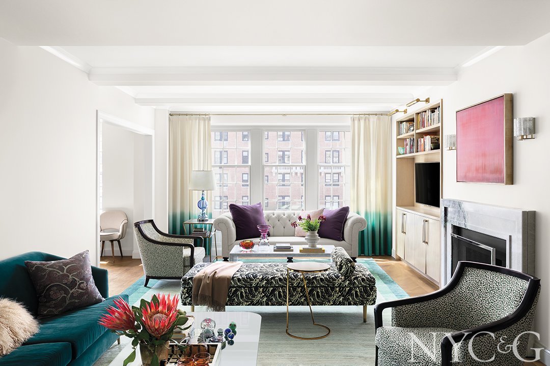
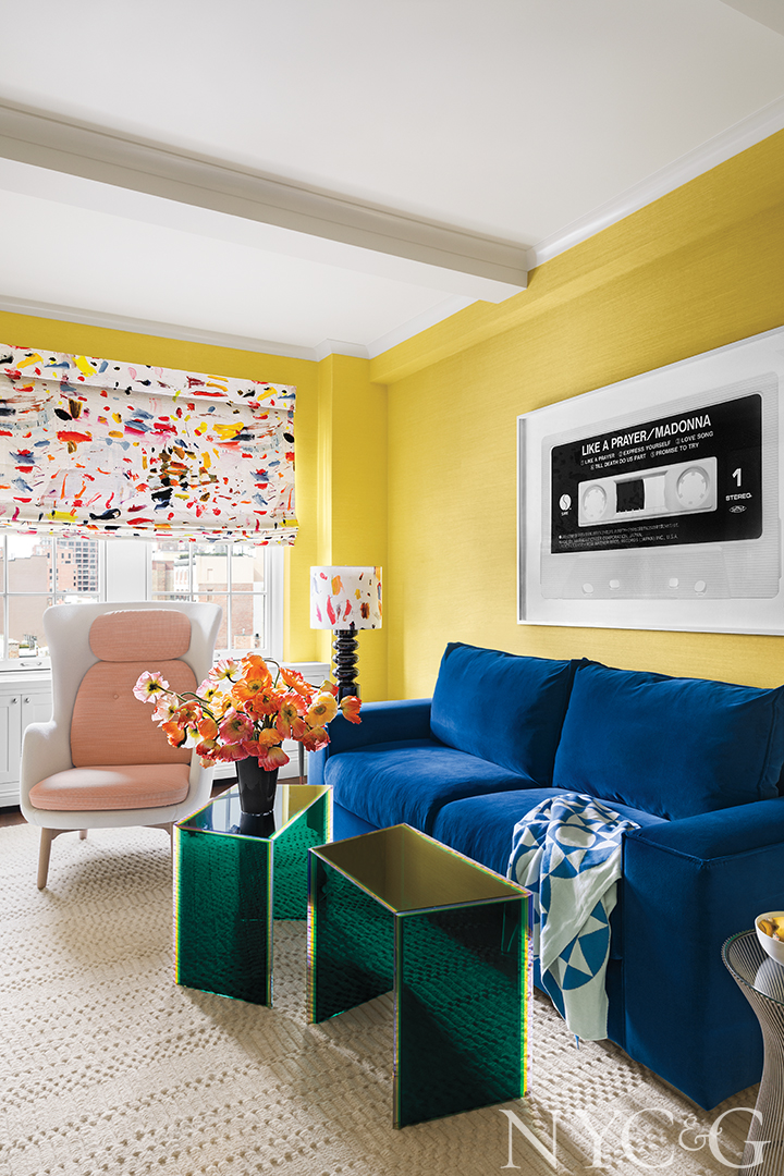
Our client is a pure color lover and not afraid to use it—she doesn’t like anything that’s too quiet. That’s music to any designer’s ears! She especially loves pink and purple, but you have to be careful using those colors. The jewel-toned palette that resulted is sophisticated, but fun.
Even though the wallpaper in the entry is subtler in color, it still makes quite a statement. Tell me more about that choice.
I was trying to create a beautiful passageway from the vestibule into the living room, and wallpaper seemed like the ideal way to make the connection. We also used a pale-pink paint-finish lacquer on the ceiling, which gives the space a “jewel box” feeling when you walk through, almost like it’s a different room in the house, rather than a pass-through area.
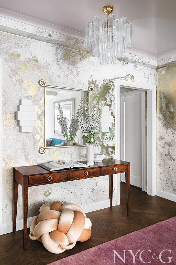
In the vestibule, a purple marble lamp sits on a vintage buffet scored on 1stdibs.
In the living room, a daybed from 1stdibs has been reupholstered in a fabric from Holly Hunt. The Chesterfield sofa is from Mitchell Gold + Bob Williams.
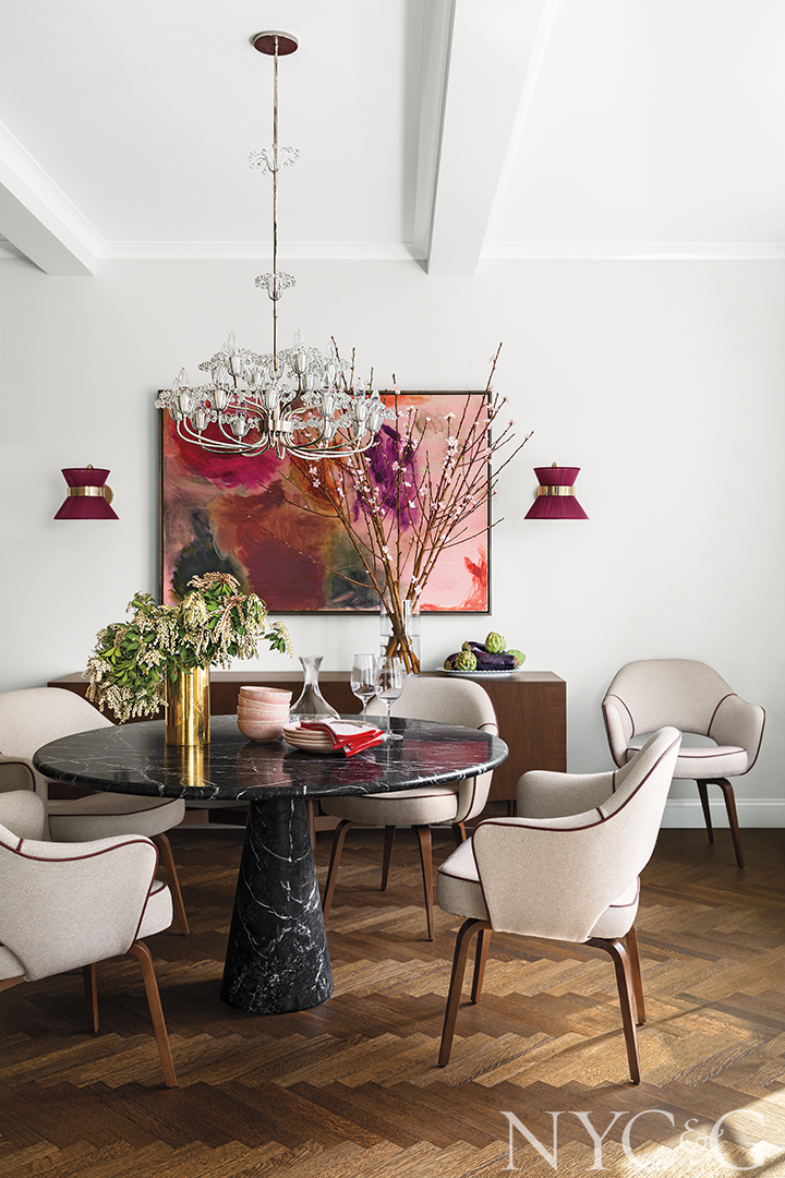
Chairs from DWR surround a table from Suite NY in the dining room. The artwork is from Sears-Peyton Gallery.
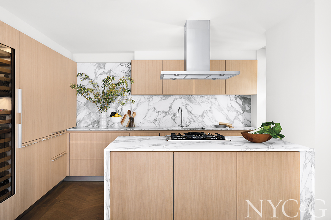
The kitchen features Bulthaup cabinetry and a hood, range, and other appliances from Gaggenau.
Living sofa in the guest room/ den is covered in a Dedar velvet. The chair is from Fritz Hansen and the roman shade and lamp fabric is from Pierre Frey.
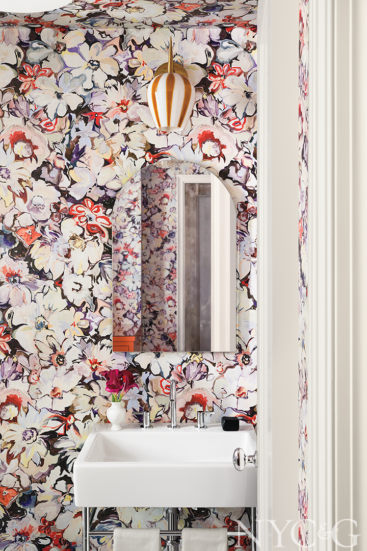
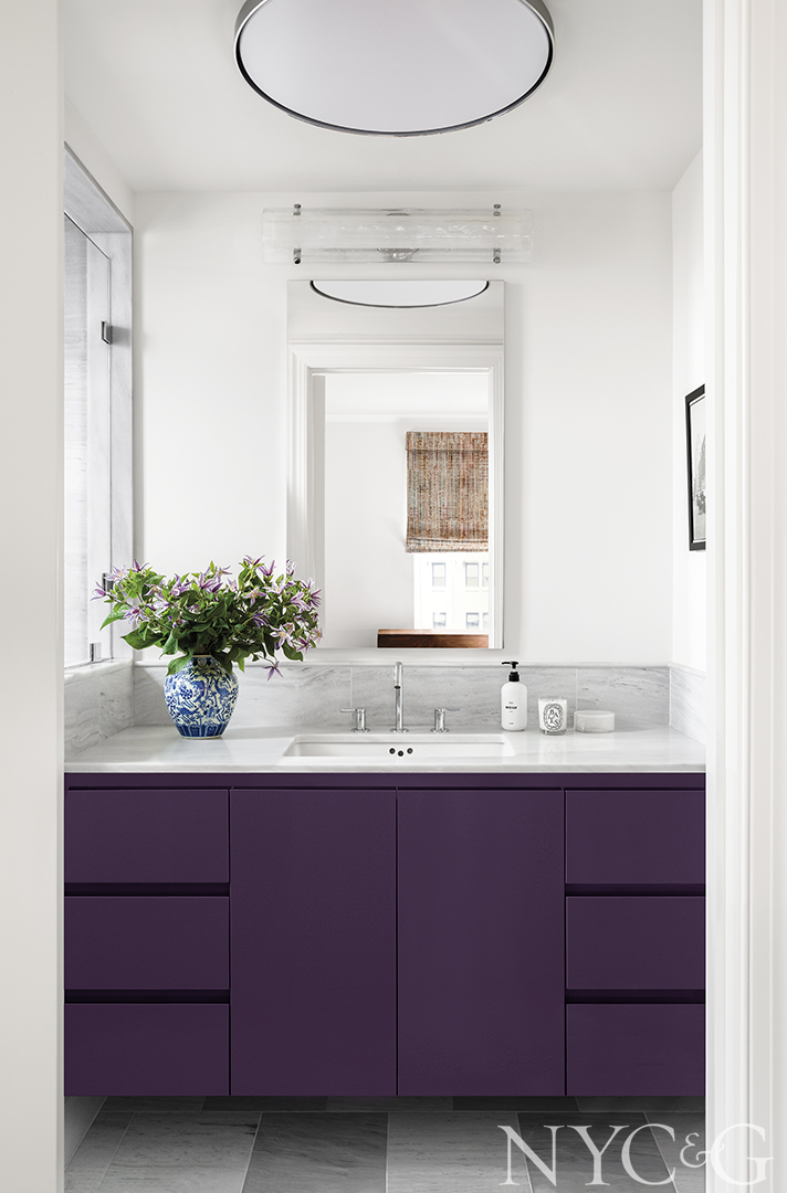
In a powder room, a floral Voutsa wall covering anchors a Duravit vanity and fittings.
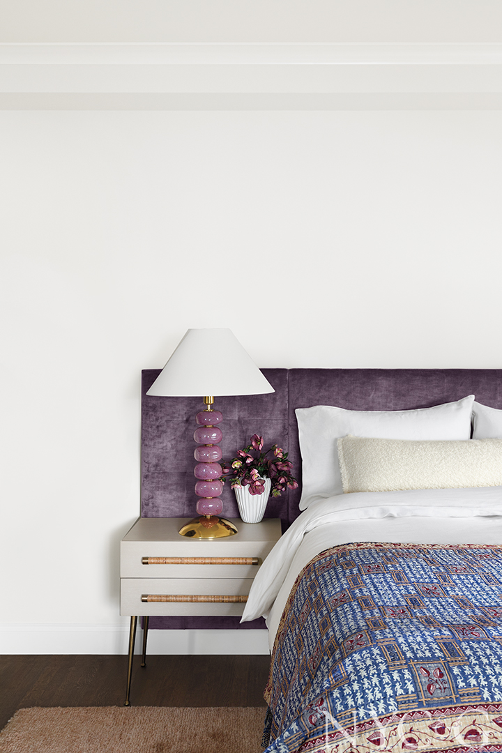
The primary bedroom features a custom headboard upholstered in Venetian Violet from Kravet and end tables from Chelsea Textiles.
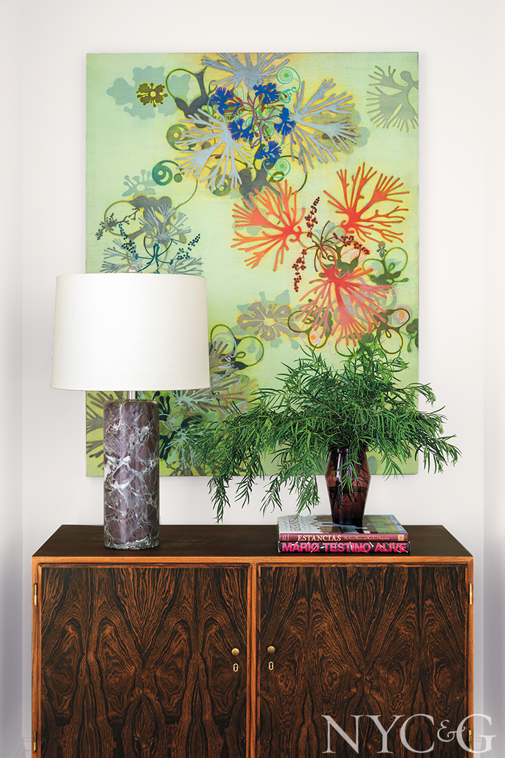
In virtually every room, artwork is clearly important to this project.
Some pieces already belonged to our client, and some were sourced and purchased for our client separately. The pieces in the living and dining rooms are color forward, but also quite serene. Our client just happens to love Madonna and loves to dance, hence the fun piece in the guest room.
When you’re working with color, what tricks do you employ? How much color is too much?
I’m not a maximalist and I don’t do lots of pattern over pattern, although I like to play with scale a lot. Our work is restrained in some ways, and we typically stick to a tight palette. There should be a thread running through each room. In the living room, for example, there are some purples on both sofas and some greens in the rugs and draperies, but it’s not a color explosion. The continuity is there.
How about the dining room, where a minimalist table somewhat surprisingly comes off as warm and inviting?
The client fell in love with the table early on, and we went with vintage lighting as an accent. We have a real affinity in our office for vintage lighting. I’d describe the space as “feminine vintage”—a little sparkly and a little fancy, but also loaded with texture and materiality.