


On embarking on any new project with a client, designer Jennifer Mehditash says: “We need to hold hands and jump, otherwise it’s not going to work. Trust is the most important thing.” Mehditash, who started her career in Portugal at a large firm, reopened Mehditash Design with a more personalized approach when she moved stateside—her family first relocated to Westchester and later Newport Beach. “
So when a Rowayton couple saw the California–based Mehditash’s work at a friend’s house in town, they reached out to her for help with their own reno one block over. “They wanted to be part of the design process, but wanted me to add color and take it one step further,” says the designer. “It’s a year-round house and they wanted something unique, rather than just a neutral beach house kind of feeling.”
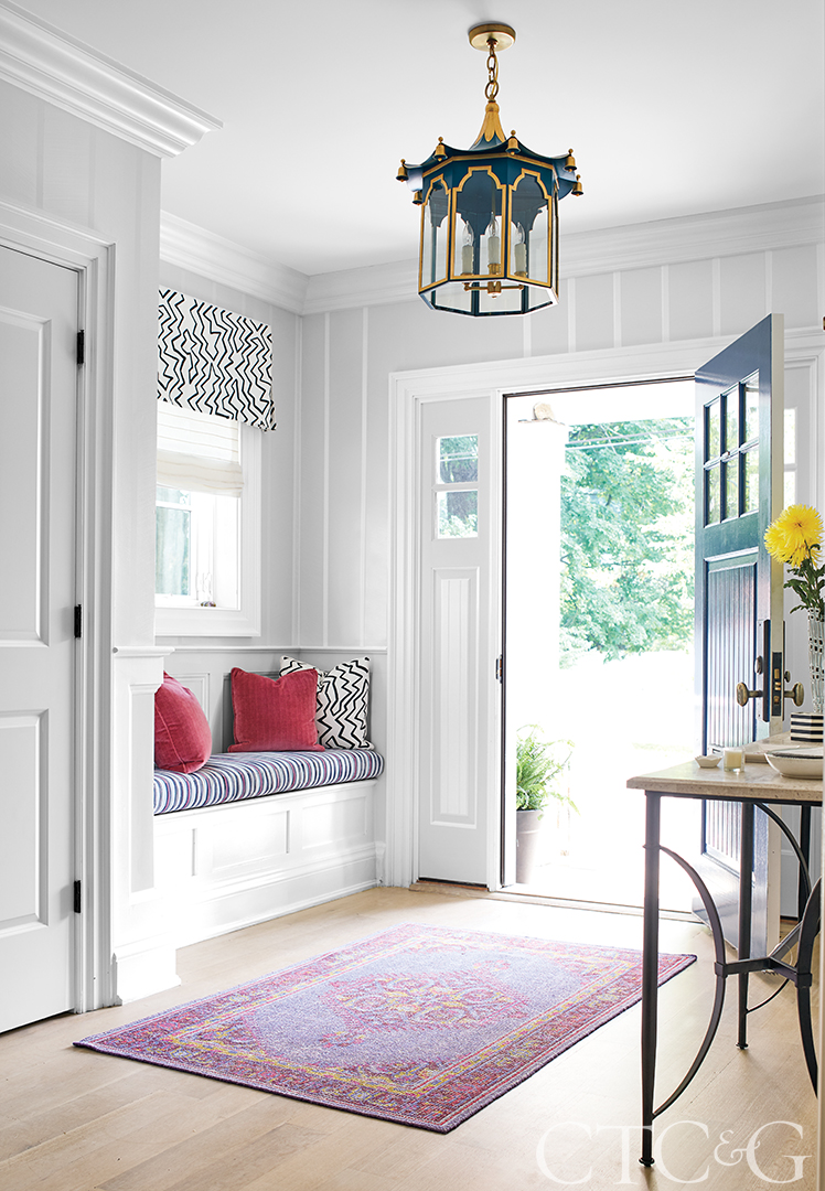
A custom pagoda lamp from Coleen and Company hangs in the entry. The walls are handpainted by Floe Painting.
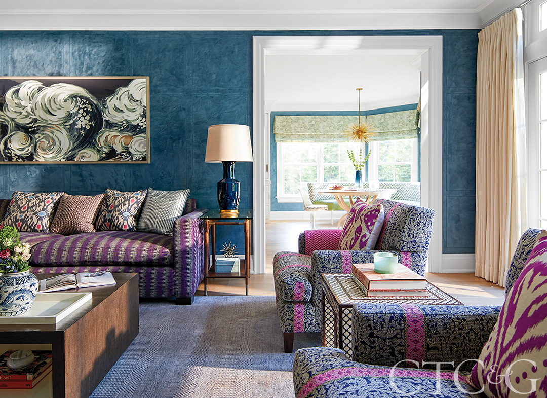
Venetian plaster by Floe Painting covers the family room walls. Artwork from Natural Curiosities hangs above a custom sectional in the family room that wears an ikat from Highland Court. The coffee table is through Theodore Alexander. The kitchen banquette in the background is covered in a laminated Mally Skok Design linen.
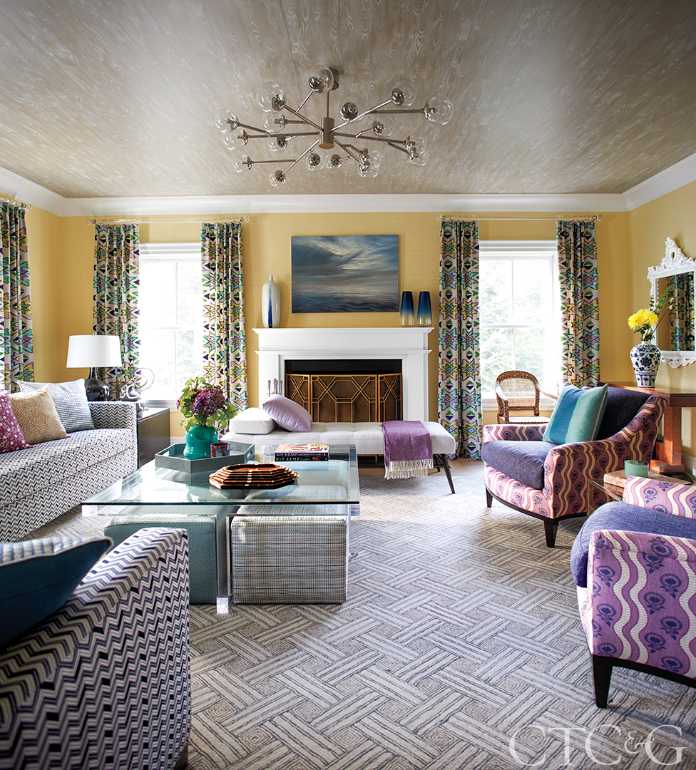
In the living room, a Clarke & Clarke embroidery makes a statement as curtain panels. A purple cashmere throw adorns a daybed from Wakefield Design Center. The walls are covered in a yellow paper weave from Thibaut, and side chairs wear a mix of a solid Clarence House fabric with a Tilton Fenwick for Duralee print. The custom rug is through Stark.
In the dining room, Schumacher’s vibrant bargello pattern printed on woven sisal provides a textural counterpoint to glossy blue walls. The curtain panels are crafted from a Groundworks textile. The table and chairs are Celerie Kemble for Henredon. The rug is through Stark, and the chandelier is vintage.
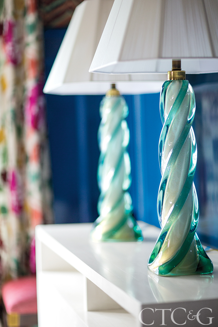
A pair of vintage lamps top a dining room console.
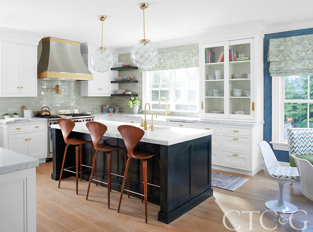
The kitchen cabinets are through Kitchens by Deane. The backsplash is crafted from custom Pratt & Larson handmade tiles.
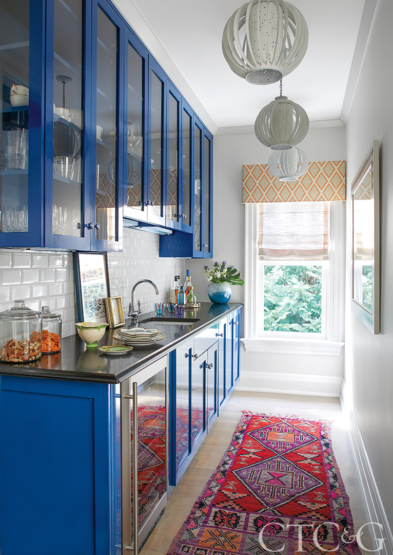
Cabinets in the butler’s pantry painted in Benjamin Moore’s Marine Blue are complemented by the client’s own vintage area rug; a Kravet valance partners with a Pindler and Pindler Roman sheer.
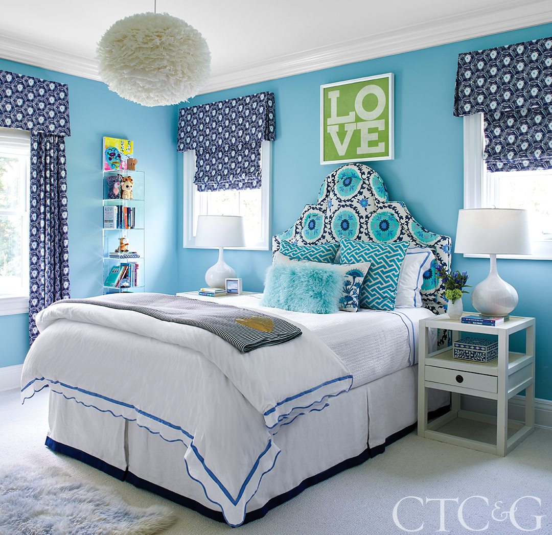
In another bedroom, a Quadrille fabric brightens the headboard. The bedside tables are through Bungalow 5.
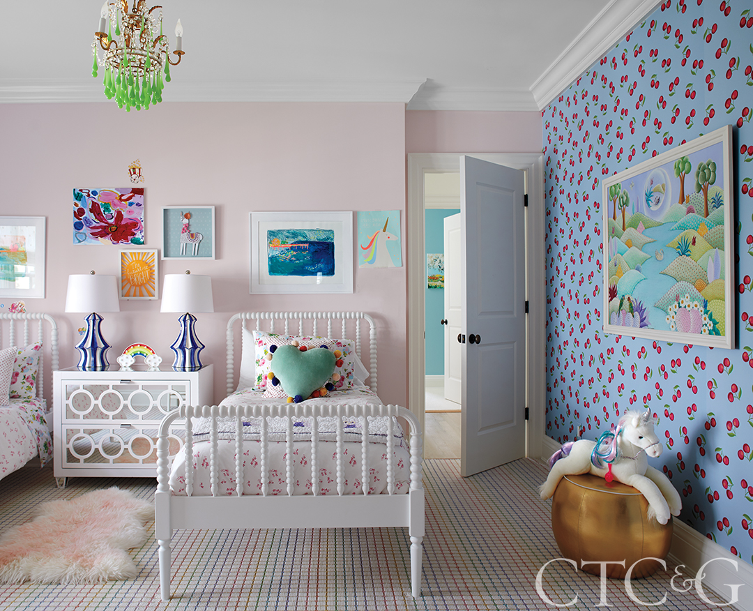
Cherries wallpaper from Serena & Lily sweetens a wall in a girl’s bedroom; the rug is through Stark; vintage lamps top a bedside table through Worlds Away.
Mehditash came on board after they started with builder Gene Salvatore of E.R. Salvatore Associates. They gutted the first and third floors—giving the awkward floor plans more flow and space for lots of seating for entertaining—while making cosmetic changes on the second. Mehditash is known for her knack for combining patterns and colors in unexpected ways, and the interiors reflect this flair in every surface of the house. “People ask me all the time what my style is and I don’t have one,” she says. “I want every project to be unique. I feed off the client and the space. I am not looking for one ‘wow’ moment or the perfect editorial picture.”
This mantra hits home as soon as you pass through the threshold. From the entry you can see the yellow papered walls of the living room, blue Venetian plastered family room, and a bold flamestitch wallcovering above high gloss paneling in the dining room. At first glance, the entry walls appear white, but it is actually a high gloss, handpainted iridescent chevron stripe. “It’s not plain white, but it does give the house a moment to breathe without being stark,” says Mehditash.
The kitchen was redone using the existing floor plan locations but maximizing that space for more storage. The floors—which are the same throughout the house—are a natural soft oak. “We didn’t want it to be too beachy but also not too dark or orange. We did a limewash treatment that gave us the perfect color and sense of calm among the playful elements.” A custom banquette is covered in a jaunty white-and-blue print. “The clients were terrified!” says the designer. “But we covered it in plastic, so it’s shiny and kitschy and practical.”
Tulip chairs surround a klismos table and keep that vintage retro vibe going while softening some of the harder angles of the room. The walls are the same Venetian plaster in the family room, but there Mehditash took it one step further with carved panels applied to the plaster walls. A sectional covered in a purple ikat is piled with pillows of various patterns and scales. Anywhere else this would be considered that notoriously overused phrase “pop of color,” but Mehditash has an uncanny ability to meld a riot of pattern and color into cohesive spaces.