


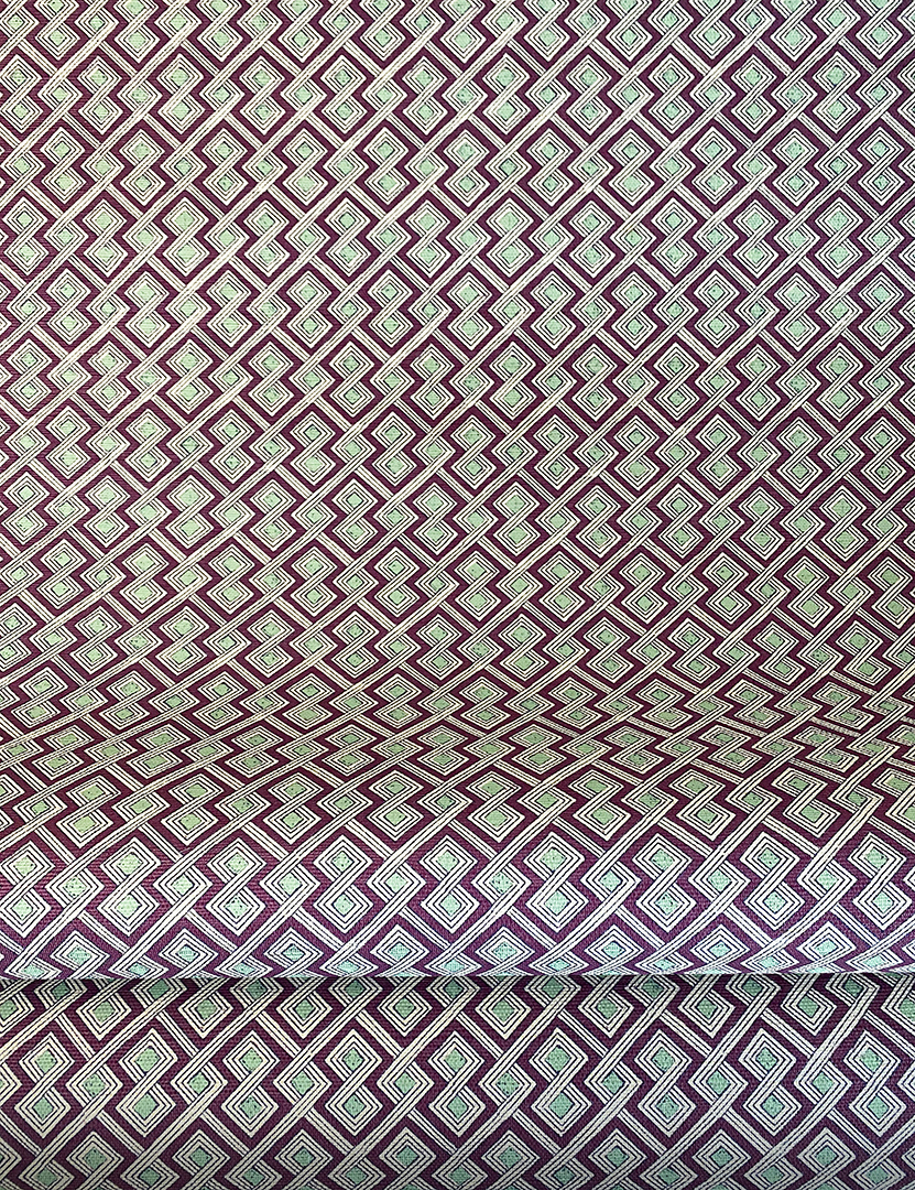
KRAVET
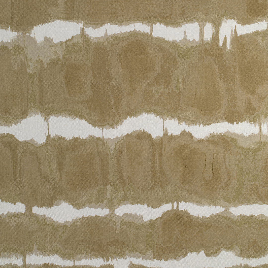
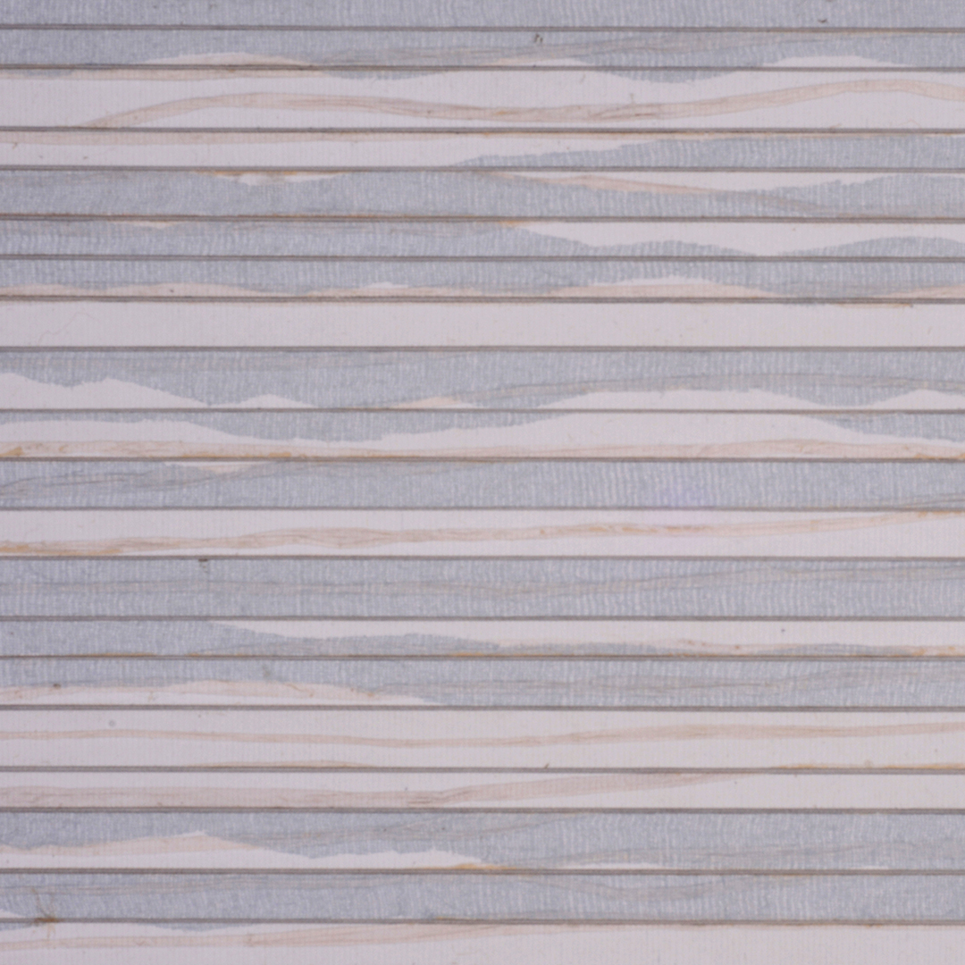
Baturi, offered as a fabric and now a grass paper, is my take on a tie-dye water stripe. I would install it in a family room surrounded by richly toned cerused and bleached woods, modern clean- lined sofas, textured pillows and throws, and tons of white.
KRAVET
From Boheme II, Nico Mod is a large-scale graphic that delivers visual impact on a single feature wall or on multiple walls enveloping a room. I love the blush colorway and imagine it used in a bedroom, dressing room, primary bath or powder room surrounded by soft, monochromatic hues. I am crazy about it—it’s the epitome of a sophisticated, feminine and modernist graphic.

KRAVET
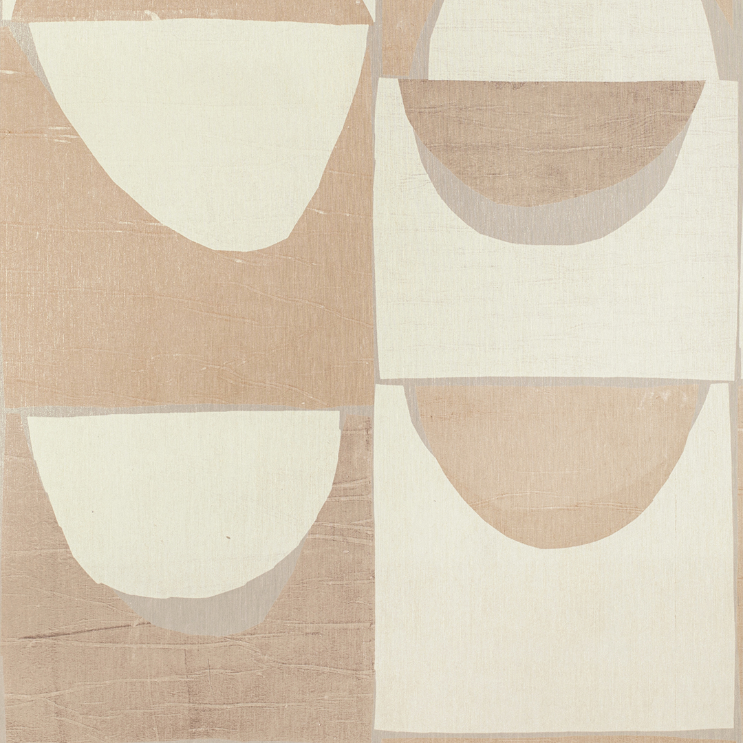
Puka also hails from my Boheme II collection for Kravet and is a medium-scaled abstract tribal pattern, offered in five colorways. Printed on a lightly sheened grass paper, it presents as a pattern/non pattern. I see it as a perfect backdrop to a family room, bedroom or powder room where one might be looking for a subtly textured wallcovering.

QUADRILLE
Persia is a wallpaper that I never tire of using. We have it in on the walls of our office. It is one of those papers that is “there but is not there.” It can provide a wonderful backdrop for framed photographs and art.

NOBILIS
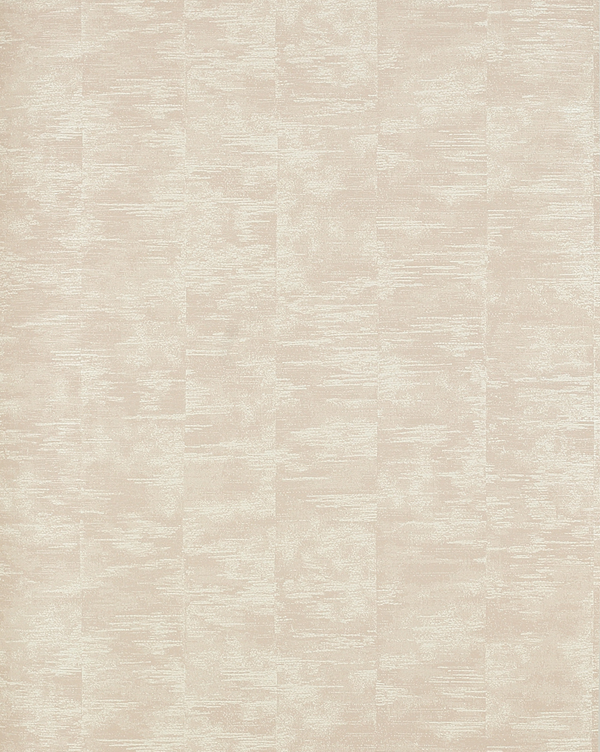
I love to use Nobilis’ faux bois papers, like Chene, to create a sense of interest and texture on ceilings.
BEATA HEUMAN
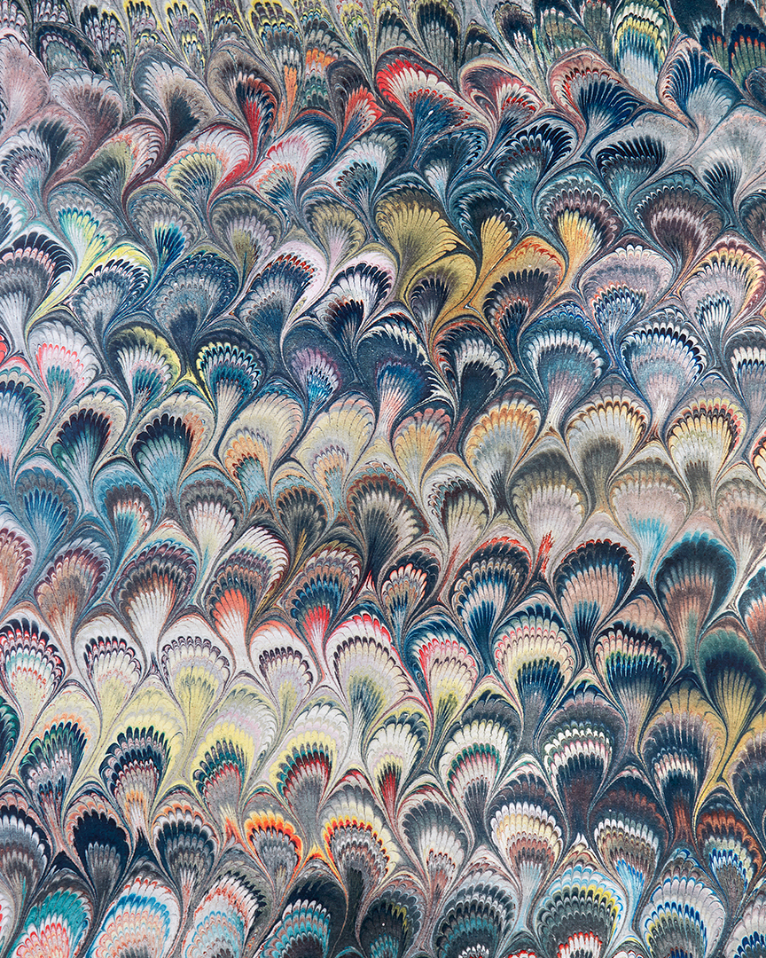
Beata Heuman’s gorgeous marbleized wallpaper is a go-to of mine for the back of bookshelves.

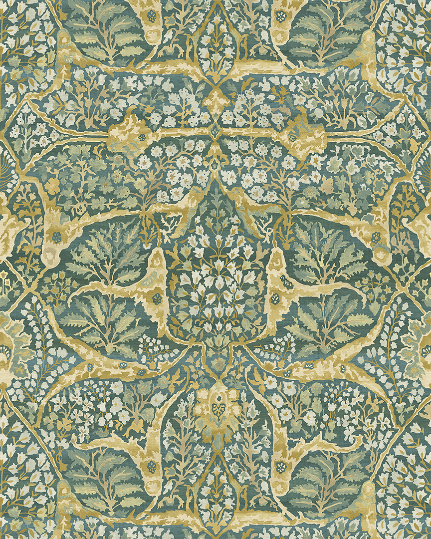
COWTAN & TOUT
Morris is an organic, textured blush and cream painterly wallpaper, perfect for a primary bedroom. It’s a great backdrop to shades of green and bold hits of black.
SCHUMACHER
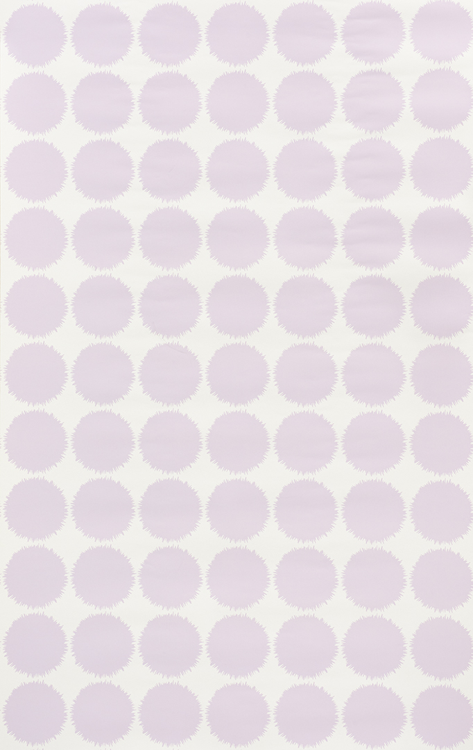
Studio Bon’s Fuzz from Schumacher is one of my favorites. I used this mid-scale dot for a feminine office. It’s playful and super chic and the lavender shade plays well with other colors.
PETER FASANO
The bold graphic pattern of Samburu really pops. I used the Nocturne colorway—a dark, soot navy—in a client’s mudroom. It provided a dramatic contrast against the stark white, shiplap walls.

Claudia Kalur of CFK Interiors has four bold picks.
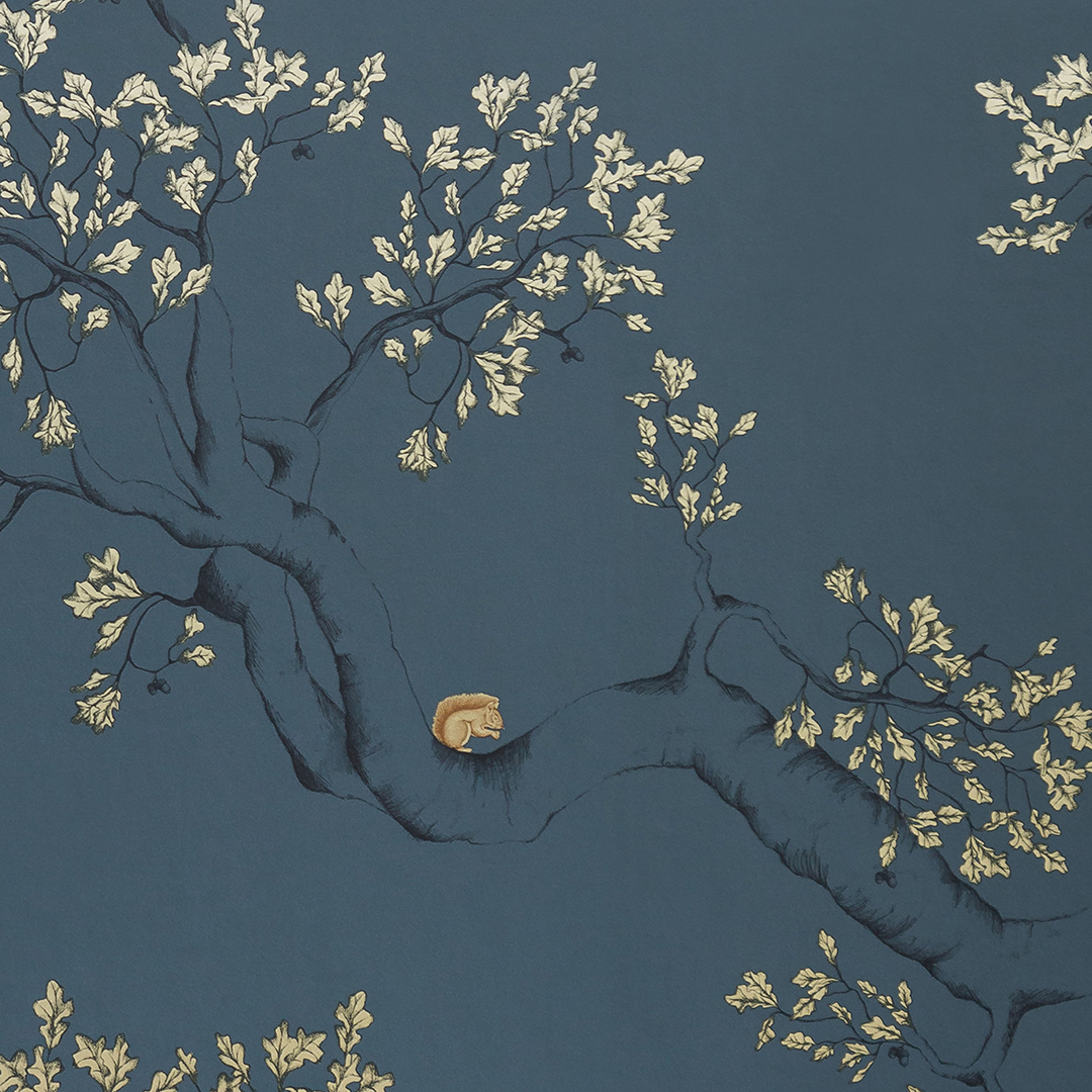
JULIET TRAVERS
I used the Nutcracker paper in the powder room of our Connecticut country house, and it just makes me so happy! It’s dark enough to be moody, but it has a bit of sparkle with the gilt details and the squirrels add a bit of whimsy.
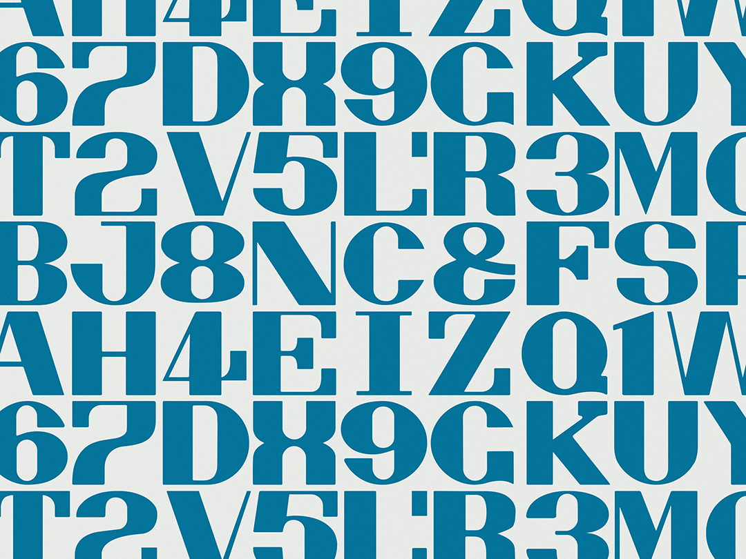
MAHARAM
I am about to install this Alphabet wallpaper in a powder room in a modern farmhouse here in Litchfield County. It’s super fun and would be great in a child’s room too.
ZAK+FOX
I have Sycomorus on my list for a future project. I love Zak+Fox fabrics and wallpapers, and this pattern is just stunning—lush and rich.
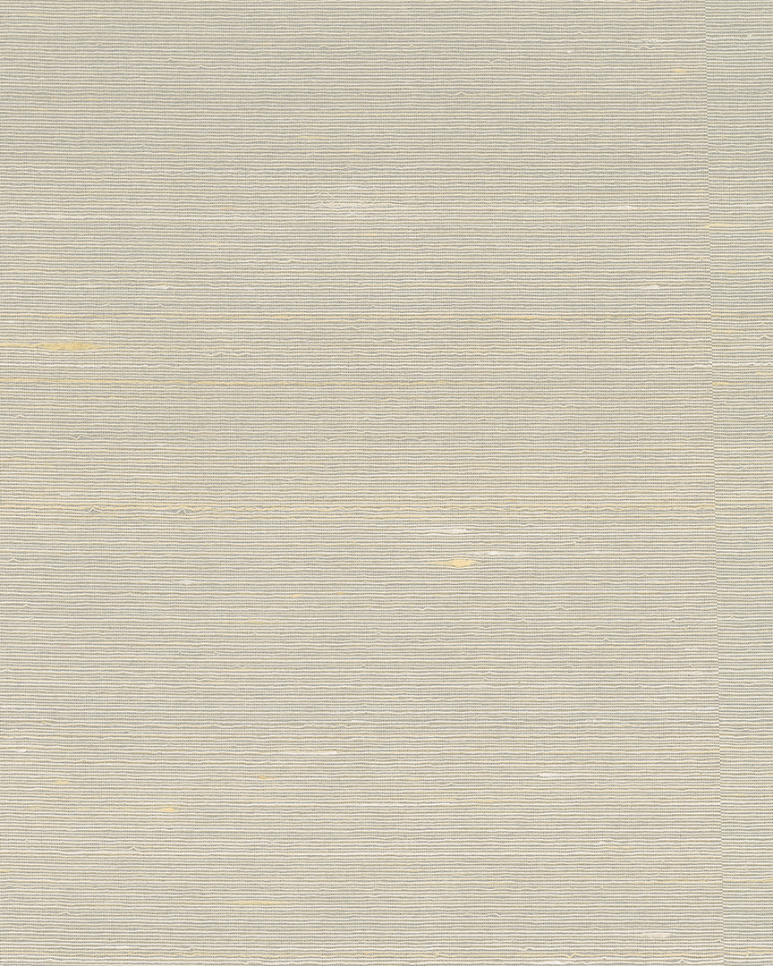
TWENTY2
I use the grasscloths from this local, private-label studio all the time, including on furniture. This one, Japanese Paperweave in Stratus, is great for an urban chic aesthetic.

Amy Zolin of Clarity Home Interiors shares four nature-inspired wallpapers.
AUX ABRIS
Aux Abris wallpapers are gorgeous. The Art Deco–style Garden of Eden mural on silk is spectacular in a dining room, and the high-impact Celtic Knots print on metallic grasscloth (shown here) looks great on a ceiling or the back of bookcases.
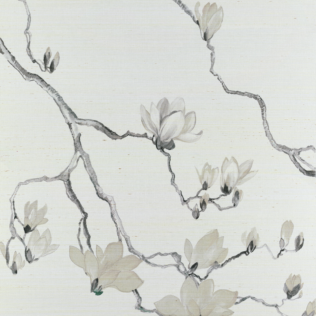
PHILLIP JEFFRIES
I am captivated by the flow of Phillip Jeffries’ Blossom. It’s a modern take on a traditional floral motif with magnolias cascading from the ceiling toward the floor. The print is sophisticated but fresh in a digitally blocked print on a textured hemp.
LEWIS & WOOD
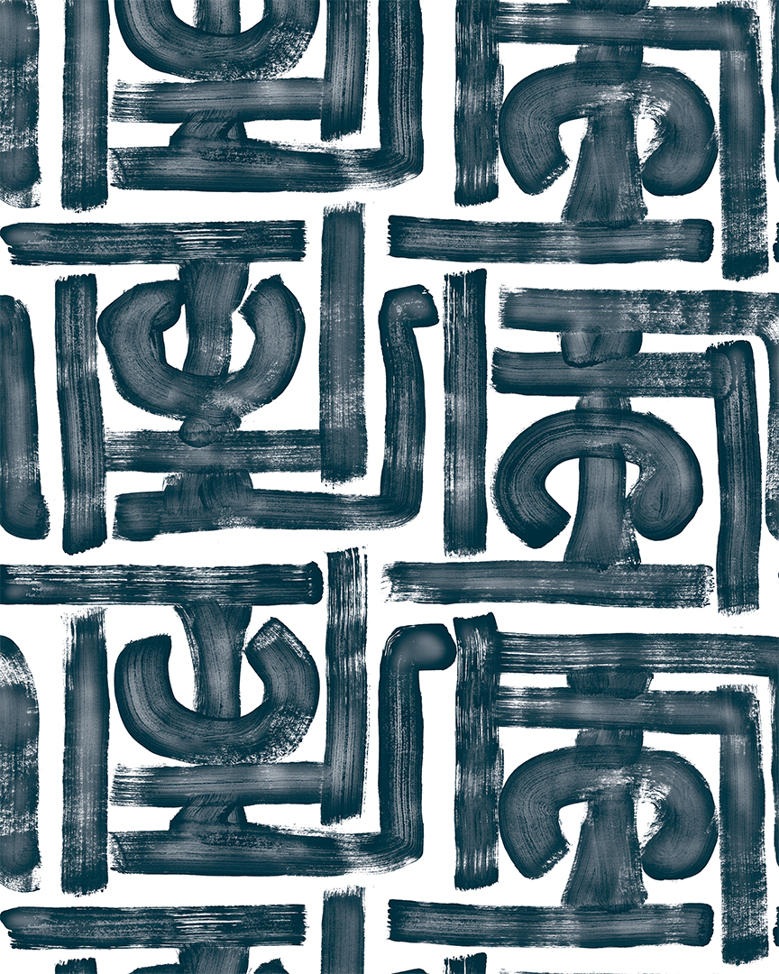
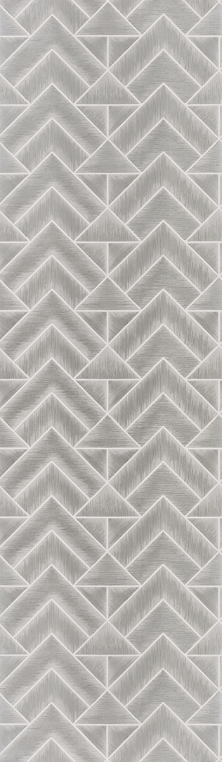
I love British brand Lewis & Wood. The curated papers are reminiscent of Old World-designs in sophisticated colorways. The Alhambra pattern is based on a Middle Eastern carpet and is offered in a full- or half-scale size.
CARLISLE & CO.
I love simple woven textures for a living room—linens if more casual and silk if more formal. They create a beautiful backdrop for furniture and art. Mica by Carlisle & Co. has reflective metallic and pearlescent properties
for organic elegance.

Stephanie Rapp has charming picks.
DESIGNERS GUILD
Let’s not forget the ceiling, especially if you are spending a considerable amount of time in your work-from-home office space. The graphic and edgy Mandora design by Designers Guild makes the most out of this fifth wall. It is tailored and stylish, balancing the serenity of the walls—the result is an overall design that has that “wow” factor, while still feeling calm and collected.
INNOVATIONS
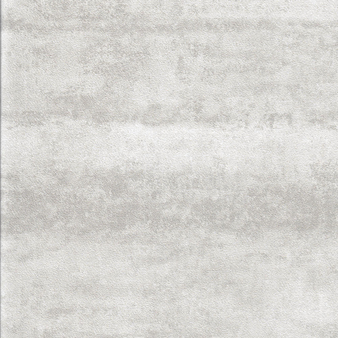
I love Innovations’ Yosemite paper for office walls. It is organic and subtle enough that it does not distract while working, yet it brings a sophisticated and chic backdrop for those Zoom calls.
PHILLIP JEFFRIES
The artisan nature of Wabi Sabi Walls wallpaper makes for a really inviting space for any family room.
It can read as coastal, organic or sophisticated. Its multilayered mix of materials, with a handcrafted effect, elevates any room with both visual and textural interest. I love how it delivers instant architecture, without any additional millwork. This paper is great for warming up those open floor plan spaces to create a comfortable haven.