


When the homeowner and her family were still living in a Manhattan apartment before moving to a Fairfield County house, she was aware that something was sorely lacking in her life. It wasn’t an existential issue. “I missed color,” she admits, referencing the nearly-all-white palette of their city dwelling. “New York has so much energy all by itself that having a monochromatic palette inside made sense there.” But upon relocating full-time during the pandemic to what had been their weekend home, she wanted something more adventurous palette-wise. “I definitely wanted color. These shades we live with now are very uplifting.”
Blues and lavender, pinks and coral, greens and aqua were already filling the house prior to the pandemic when Jacksonville, Florida–based interior designer Andrew Howard had begun his work for the family. Once the lockdown came, he and his client could only meet nightly, online. “More texts, images and phone calls were exchanged between us than any other job I’ve had,” says Howard. “What made this collaboration so fulfilling is that she’s super stylish. It’s great to collaborate with clients when their ideas are good ones,” he says with humor. Half of the decorating project was completed during the pandemic.
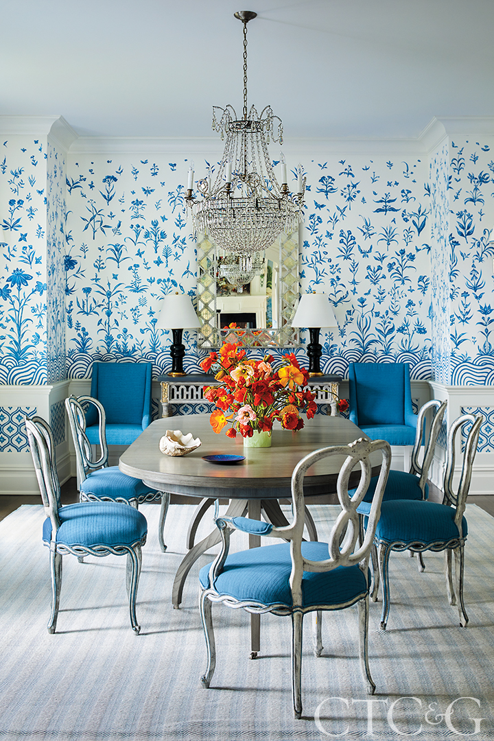
In the dining room, a muralist painted a scene of blue flora and fauna, while a blue Holland & Sherry fabric is used for the chairs. Christopher Spitzmiller lamps top the console.
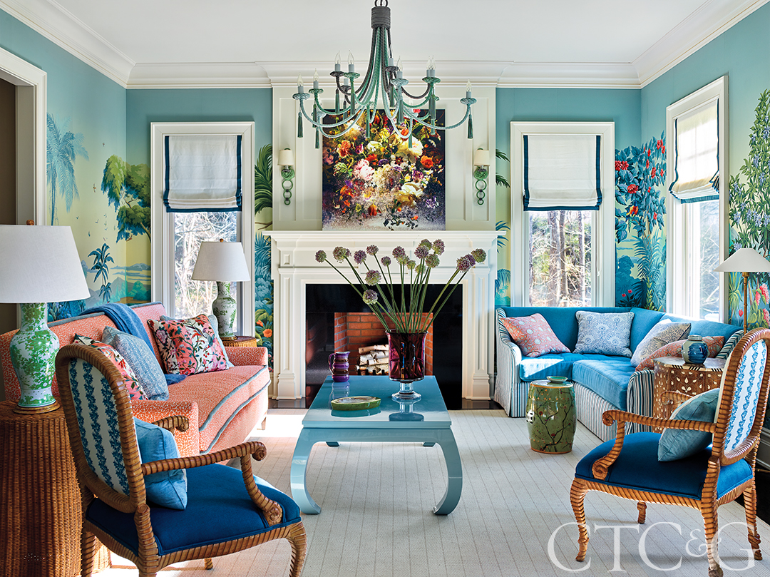
The scenery inside this living room is as vibrant and lush as that outside, accomplished with a wallcovering from de Gournay. A custom peach sofa is finished with a Sister Parish fabric. The blue sectional wears a Martyn Lawrence Bullard fabric. The blue chairs are antiques.
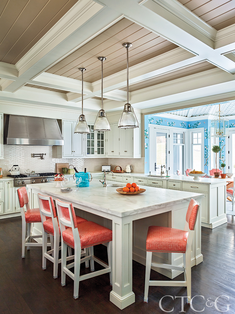
An Alex Conroy Textiles peach-hued fabric was used on the kitchen island bar stools.
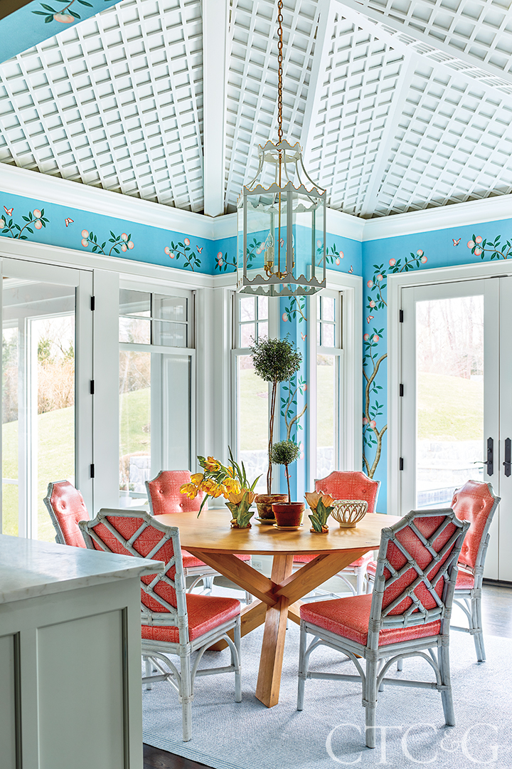
The breakfast room melds with the kitchen; interior designer Andrew Howard created a latticed ceiling there, for visual effect. The hanging lantern is from Coleen and Company.
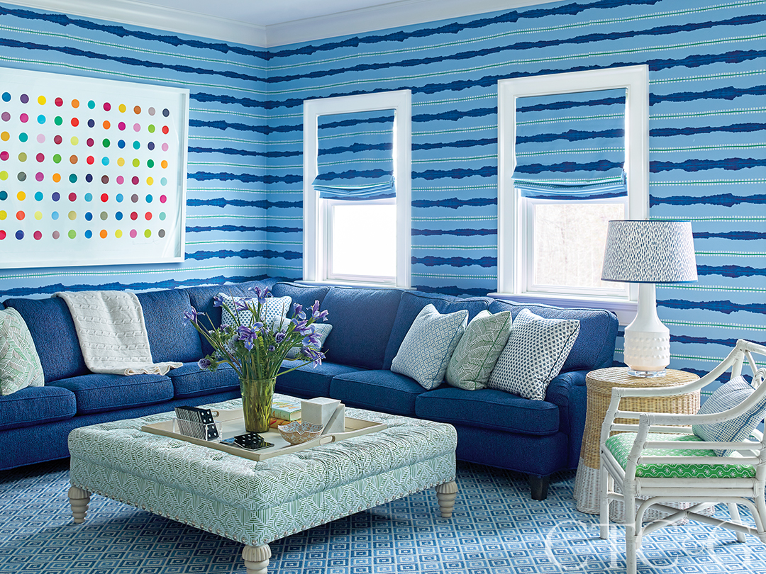
The TV room is furnished with a Bunny Williams Home ottoman, a Lee Industries sectional upholstered in a Pierre Frey fabric, and a classic Damien Hirst polka-dot print.

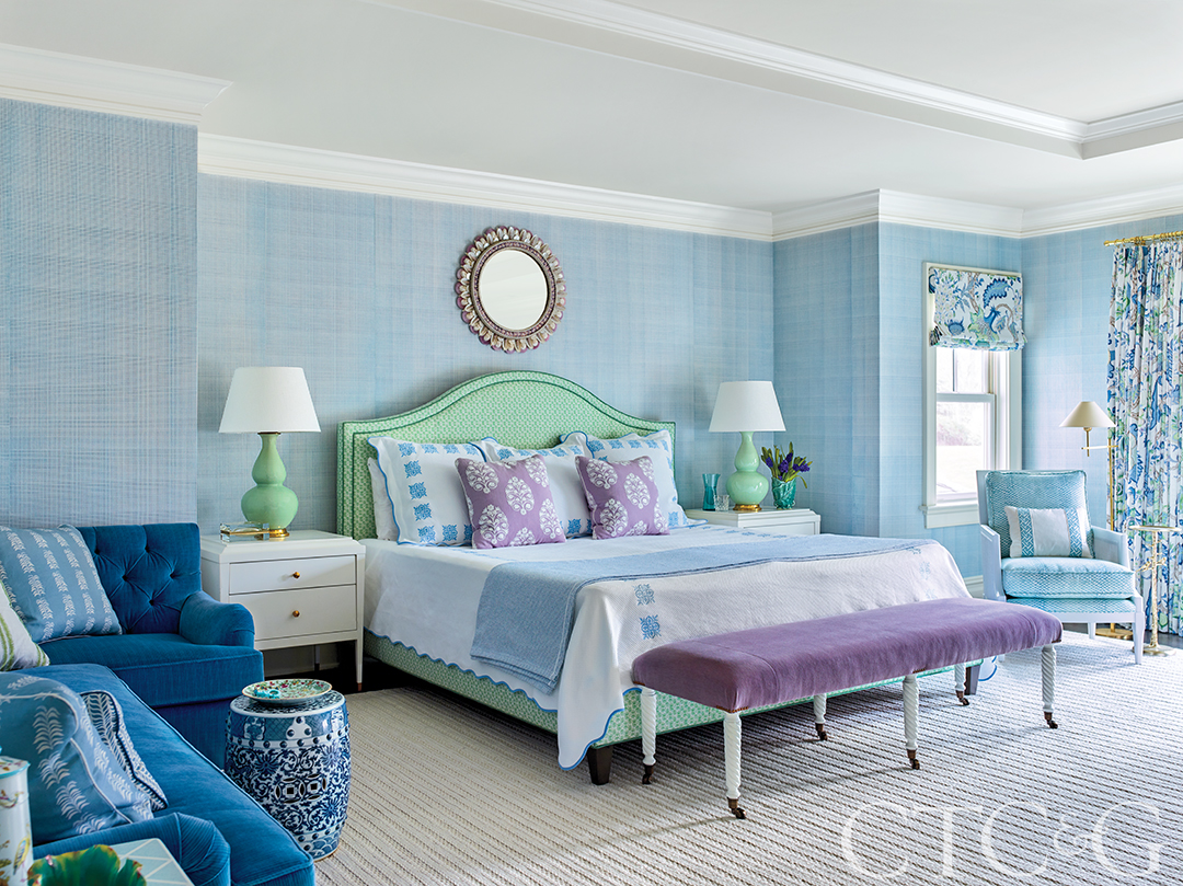
The primary bedroom incorporates a sectional sofa upholstered in Schumacher’s Strie fabric and a bench that uses a Holland & Sherry velvet.
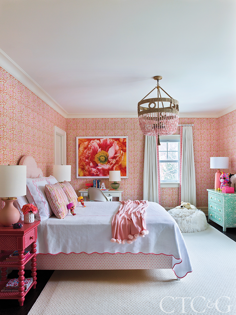
To fashion a nearly-all-pink bedroom, Howard used a Christopher Farr wallcovering and a custom bed that is dressed in an Anna Spiro Textiles fabric.
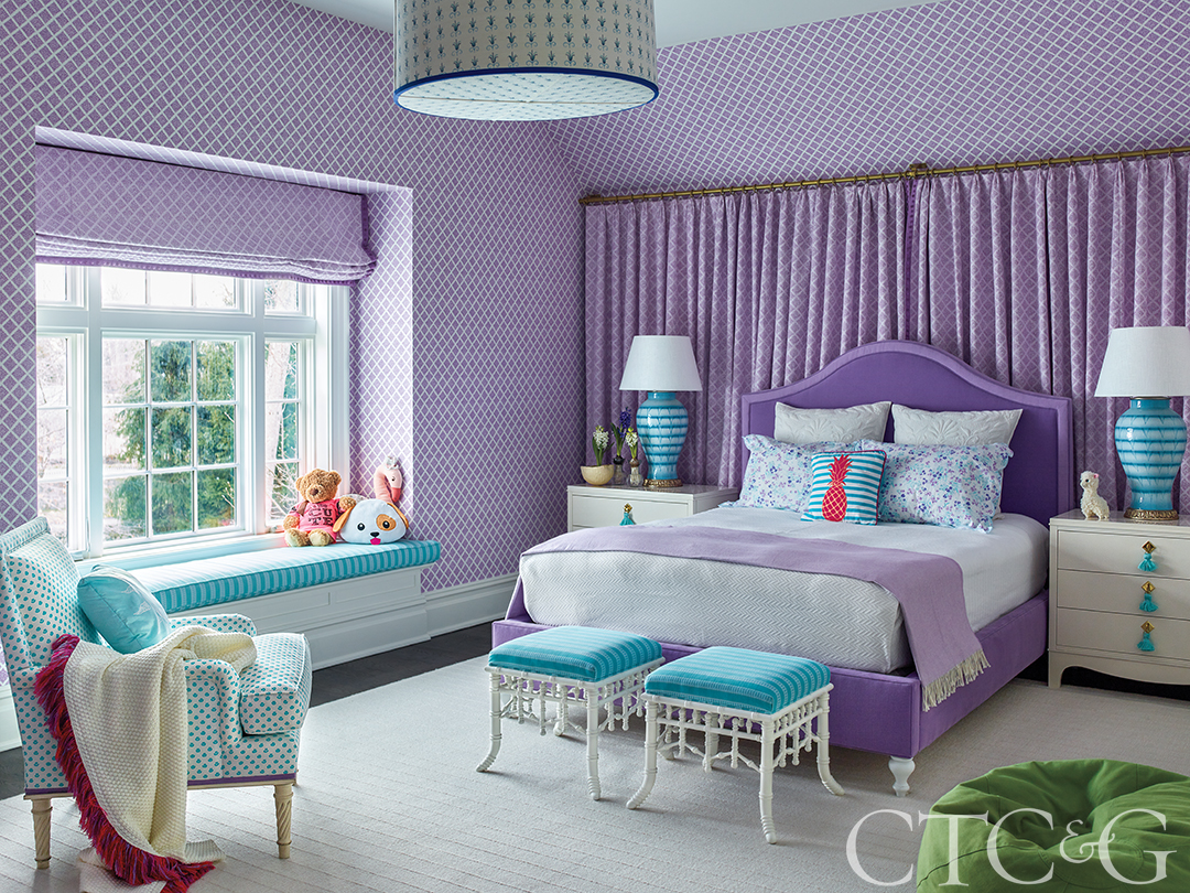
A mostly-purple bedroom is complemented by shades of aqua at the window bench, on stools at the foot of the bed, and on a pair of oversized lamps on the nightstands.
Howard is as vibrant and inspiring a personality as his selected palette. He understands how to use color without any one shade overpowering another. One of his admitted secrets is to select a large-patterned wallpaper or to paint a busy mural onto a wall, then go small-scale with other fabrics. “I let the story of a bold wallpaper pattern be told one time in a room and not again on the fabrics,” he emphasizes. Choose a busy wallcovering with multiple colors and virtually anything else chosen for the room will likely be echoed in that prevailing pattern.
Howard came upon de Gournay’s romantic, classically inspired, Edenesque scene titled Paradise Lost and thought it perfect for the living room. The client visited the company’s showroom in New York to see it firsthand while Howard drove to the showroom in Atlanta. “The day we both saw the pattern, we called each other and said this was the one.” Paradise was found, and it prevails on the living room walls, around which are positioned multiple versions of blue—from the chandelier to the coffee table to the sectional. “There are two ways to bring a house to life,” Howard says with philosophical confidence, “either with good architectural elements like millwork and beams or with color and fun wallcoverings. There’s nothing fun or happy about drywall—wallpapers are fun.”
As for the white dining room walls, a muralist was commissioned to paint, in situ, blue flowers and fauna. As the work progressed, though, Howard kept standing back to take in the unfolding scene, insisting that more and more elements be added until the walls were dense with forms. “My three daughters love to find new little characters on the walls,” says the client, “beyond the birds and butterflies. We’ve found lizards. Likewise, the children love going into a powder room and finding animals on those walls. We’ve recently discovered monkeys and leopards.”
Despite his color confidence, Howard admits that working with two colors in a room is far easier than with three. But in the the primary bedroom he embraced a tripartite of hues. “Three colors is trickier because you have more values and shades of tone. My jumping off point with color in the bedroom began with the curtains, which allowed me to introduce lavender, as well as blues and greens.”
The client has become increasingly aware of experiencing her house through other peoples’ eyes. “You see their reaction to the colors,” she says. “Life in the suburbs is, after all, pretty quiet, but when you step through the door, you find drama inside. This doesn’t look like your typical suburban house.”